19 Two-Tone Kitchen Cabinet Ideas That Feel Beautifully Styled and Worth Every Save
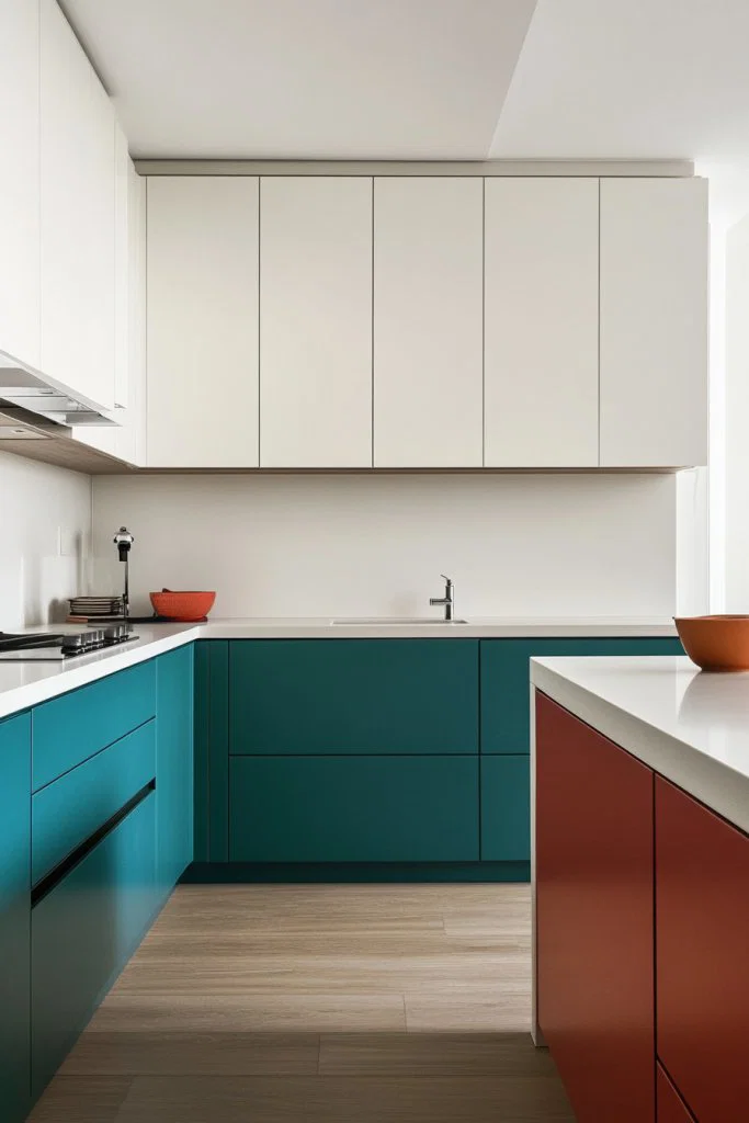
Two-tone kitchen cabinets transform an ordinary cooking space into a visually dynamic room with personality and depth. Combining two carefully chosen colors creates balance, contrast, and a custom look that suits any interior style.
Two-tone cabinetry works by pairing upper and lower cabinets in contrasting or complementary colors, instantly adding visual layers to your kitchen walls and furniture. This approach lets you introduce bold color without overwhelming the entire room.
The technique suits every style, from sleek modern interiors to warm farmhouse kitchens, because the color combinations are endlessly flexible. Choosing the right pairing depends on your existing wall color, flooring, and the overall mood you want the room to carry.
1. White Uppers, Bold Lower Cabinets
Crisp white upper cabinets reflect light around the room and create an open, airy feeling across the upper half of the kitchen. Deep navy, forest green, or rich emerald lower cabinets ground the space with strong color and make the whole room feel anchored and intentional.
Choose a semi-gloss finish for the white uppers so surfaces stay easy to wipe clean after daily cooking. Pair the bold lower color with matte black or brushed nickel hardware to sharpen the contrast and add a modern edge to your cabinetry.
2. Two-Tone Cabinets, Wood Accent Details
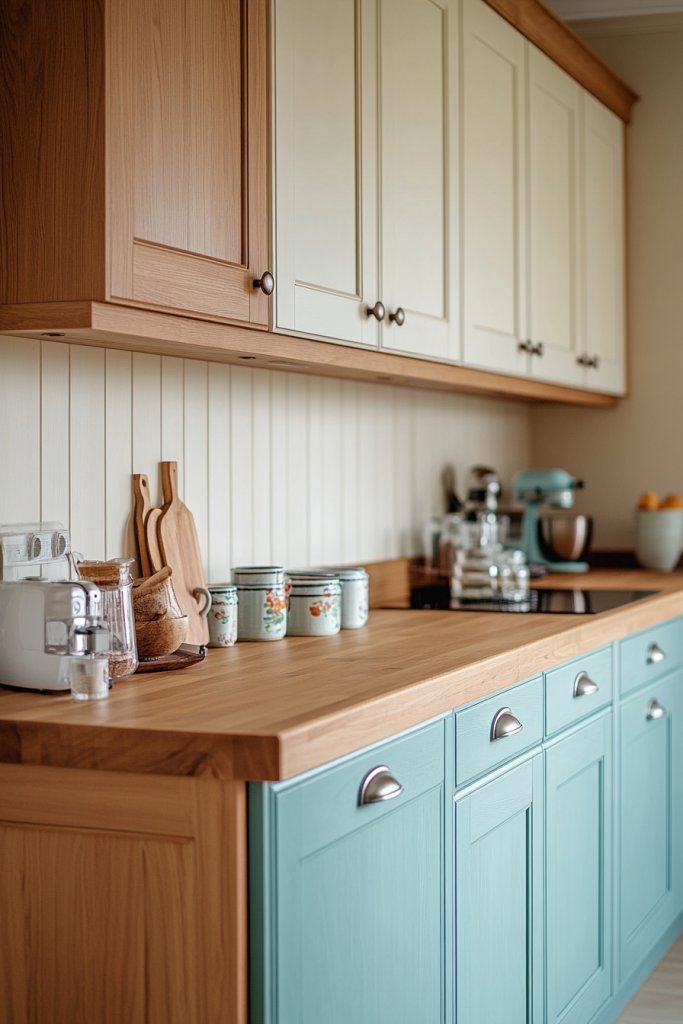
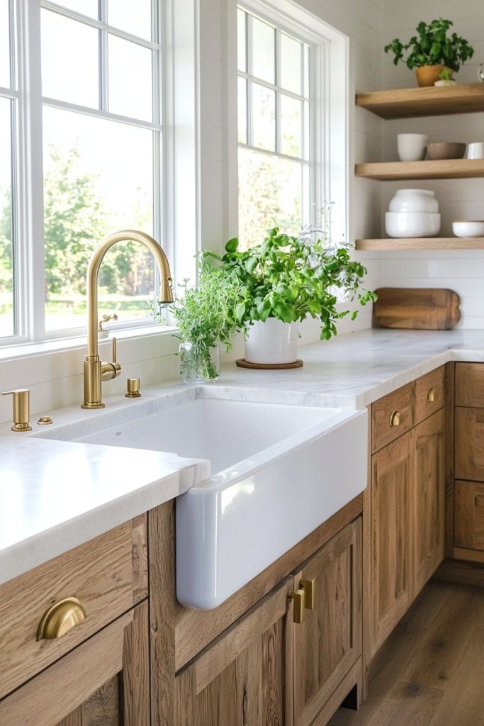
Pairing painted cabinets with natural wood accents brings warmth and organic texture into a kitchen that might otherwise feel too polished or cold. White or grey uppers combined with wood-toned lower cabinets create a grounded, nature-inspired interior that feels both current and inviting.
Choose a consistent wood tone across lower cabinet doors, open shelves, or a kitchen island to keep the look cohesive rather than scattered. Seal natural wood surfaces with a matte protective finish so they resist moisture and hold their warm color over time.
3. Matte Black Uppers, Grey Lower Cabinets
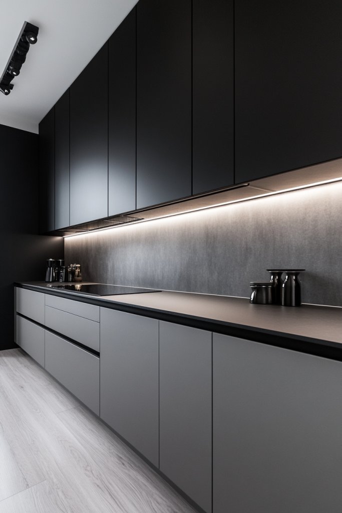
Matte black upper cabinets introduce drama and sophistication to the upper zone of the kitchen without making the whole room feel dark or closed in. Pairing them with soft light grey lower cabinets balances the weight of the black and keeps the overall palette feeling refined.
Use matte finishes on both cabinet tones to create a unified, contemporary look that avoids any jarring contrast between surfaces. Add warm metallic hardware in brass or gold to soften the dark palette and introduce a touch of luxurious detail to the cabinetry.
4. Pastel Tones, Bright White Cabinets
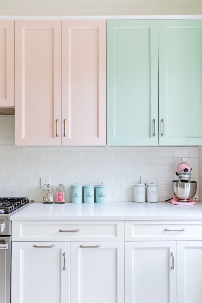
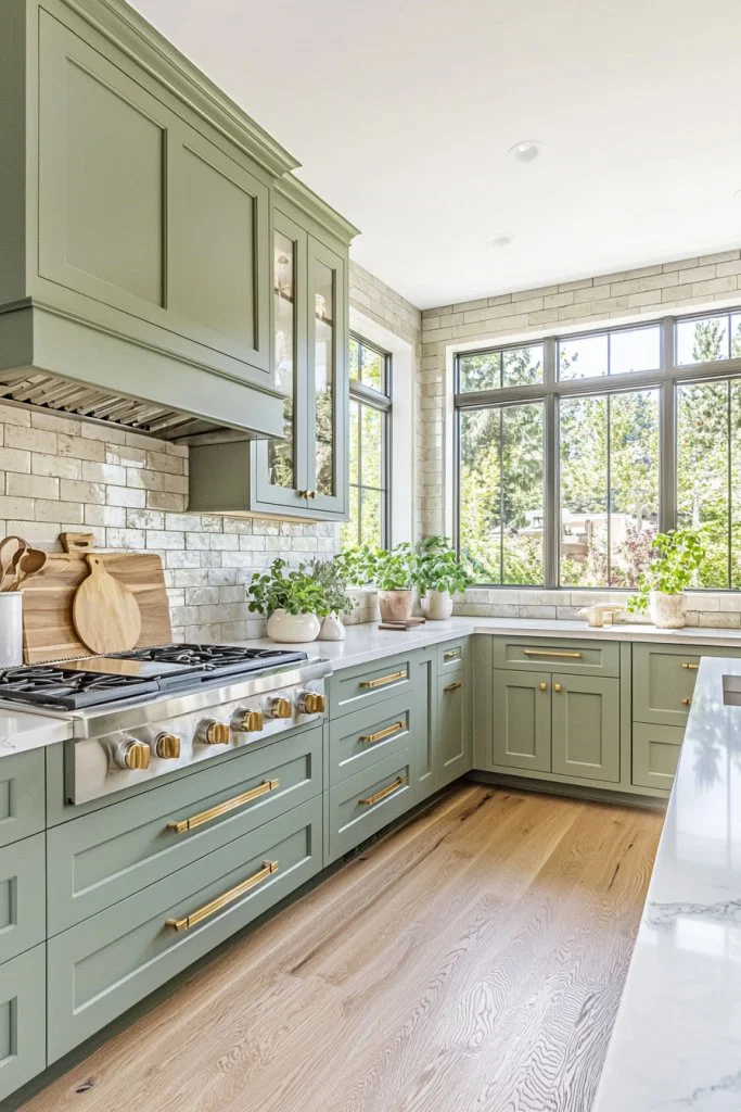
Soft pastel lower cabinets in sage green, dusty blue, or blush pink paired with bright white uppers bring a gentle, cheerful energy into the kitchen without feeling overpowering. The light color palette keeps the room feeling fresh and open while adding just enough personality to make the space feel designed.
Choose pastel shades with grey or muted undertones rather than vivid primaries so the color reads as sophisticated rather than juvenile. Swap out cabinet hardware for soft gold or white ceramic knobs to reinforce the delicate, curated feeling of the overall color story.
5. Glass-Front Uppers, Solid Lower Cabinets
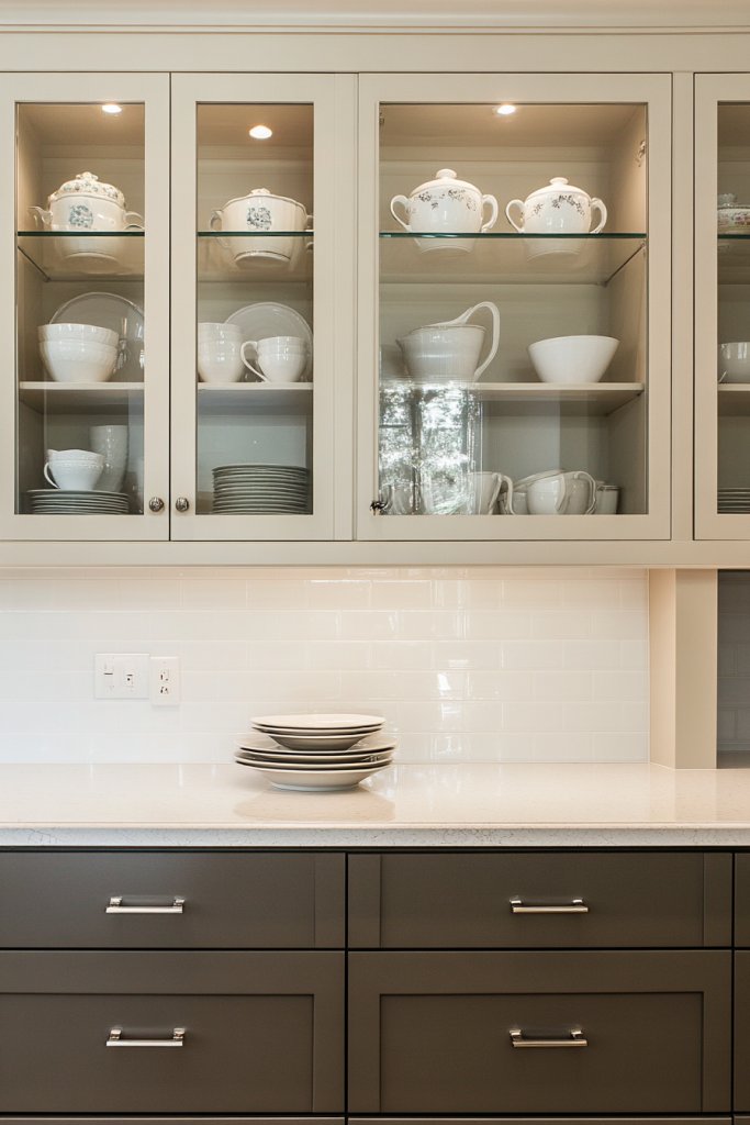
Glass-front upper cabinet doors create an open, display-friendly zone above the counter while solid lower cabinets keep clutter hidden and the lower half of the kitchen visually tidy. The contrast between transparent uppers and opaque bases adds an architectural layer that makes even a simple kitchen feel considered and stylish.
Style the interior of glass-front cabinets with matching dishware, small plants, or decorative objects that complement the lower cabinet color. Paint the interior back panel of the glass cabinets in the same tone as the lower cabinets to tie both zones together visually.
6. Shaker Cabinets, Two Contrasting Colors
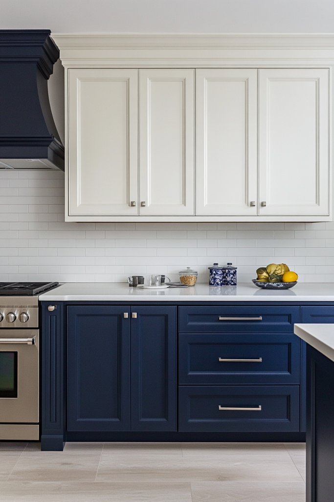
Shaker-style cabinet doors with their clean recessed panels suit two-tone schemes perfectly because the simple lines allow color to do the visual work without competing details. Pairing dark lower shaker cabinets with lighter uppers in a complementary tone creates a classic, structured kitchen that feels both timeless and fresh.
Keep door profiles consistent across both cabinet tones so the only variable between upper and lower units remains the color itself. Choose colors from the same undertone family, both warm or both cool, so the two tones feel harmonious rather than accidental or mismatched.
7. Bold Island, Contrasting Lower Cabinets
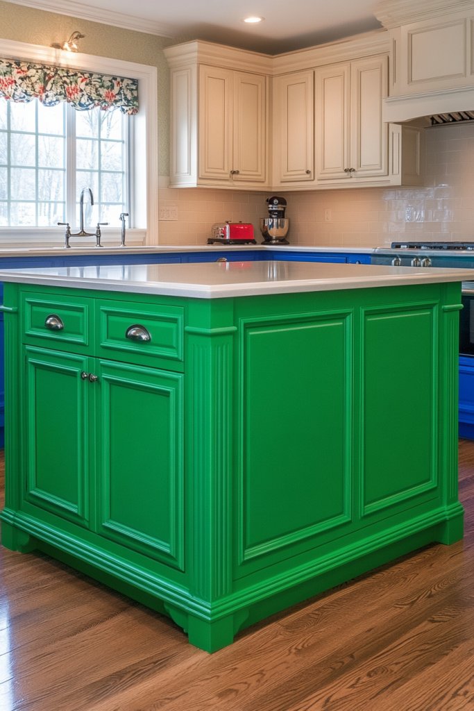
Painting the kitchen island in a bold accent color while matching the lower perimeter cabinets in the same or a closely related tone creates a strong focal point that anchors the entire room. Upper cabinets in white or a light neutral keep the eye moving upward and prevent the bold lower palette from making the space feel heavy.
Choose an island color one or two shades deeper than the perimeter lower cabinets to create a subtle hierarchy that feels intentional. Add matching bar stools or pendant lights above the island in a coordinating tone to extend the color story beyond the cabinetry itself.
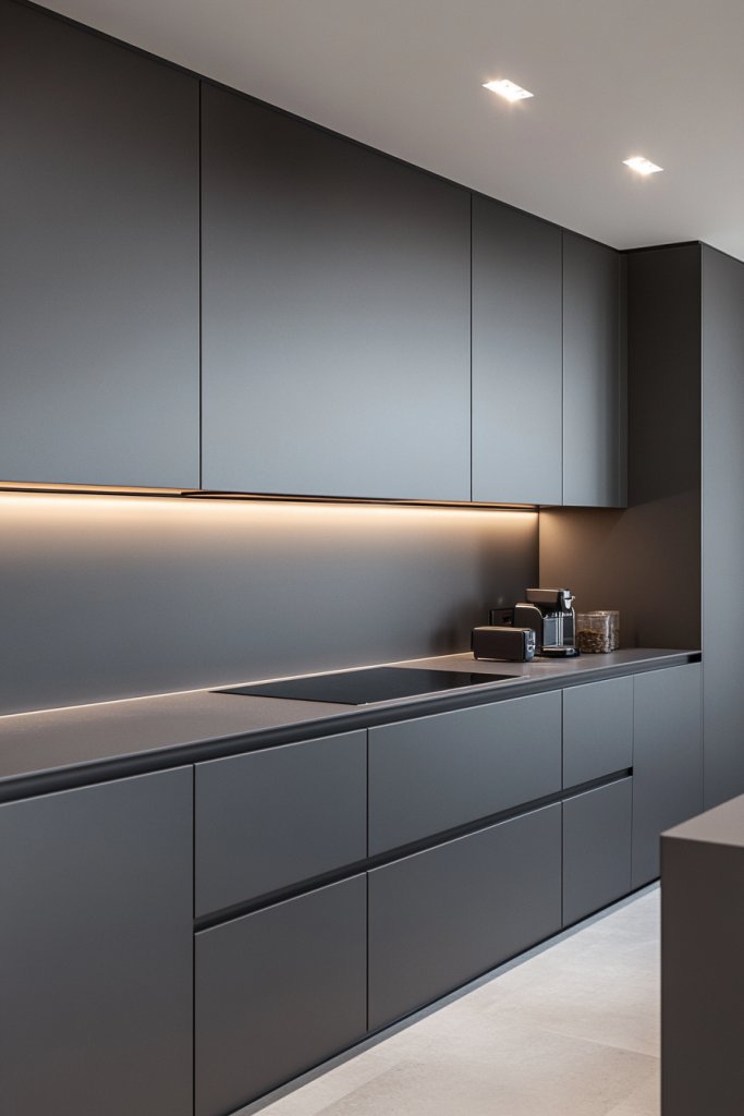
8. Minimalist Matte Two-Tone Cabinets
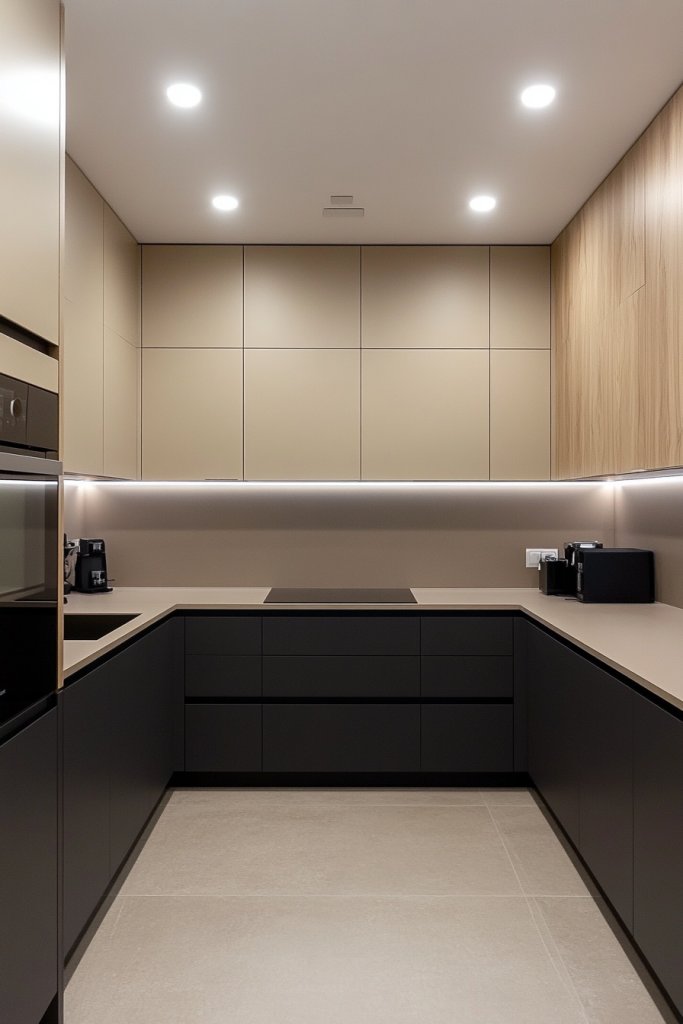
A minimalist two-tone kitchen uses just two carefully chosen matte colors across flat-front or handle-free cabinets to create a sleek, uncluttered interior with strong visual impact. The absence of decorative hardware and ornate door profiles lets the color pairing carry all the design weight across the room.
Select colors that sit close on the tonal spectrum, such as warm white paired with soft greige, so the two-tone effect reads as refined rather than stark. Integrate push-to-open cabinet mechanisms to eliminate handles entirely and preserve the clean, seamless surface of a truly minimalist kitchen design.
9. Vintage-Style Soft Pastel Cabinets
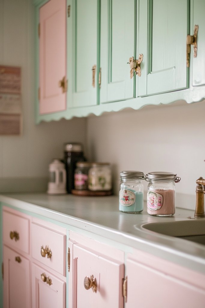
Vintage-inspired two-tone cabinets use chalky, muted pastel tones like duck egg blue, soft butter yellow, or faded rose to create a kitchen with a warm, nostalgic character. Pairing two of these soft shades across upper and lower cabinets produces a layered, collected look that feels personal rather than showroom-perfect.
Apply chalk paint or a flat matte finish to cabinet surfaces to achieve the slightly worn, period-appropriate texture that defines the vintage aesthetic. Add antique brass or ceramic knob hardware to reinforce the vintage style and bring small moments of decorative detail to the cabinetry.
10. Monochrome Cabinets, Mixed Textures
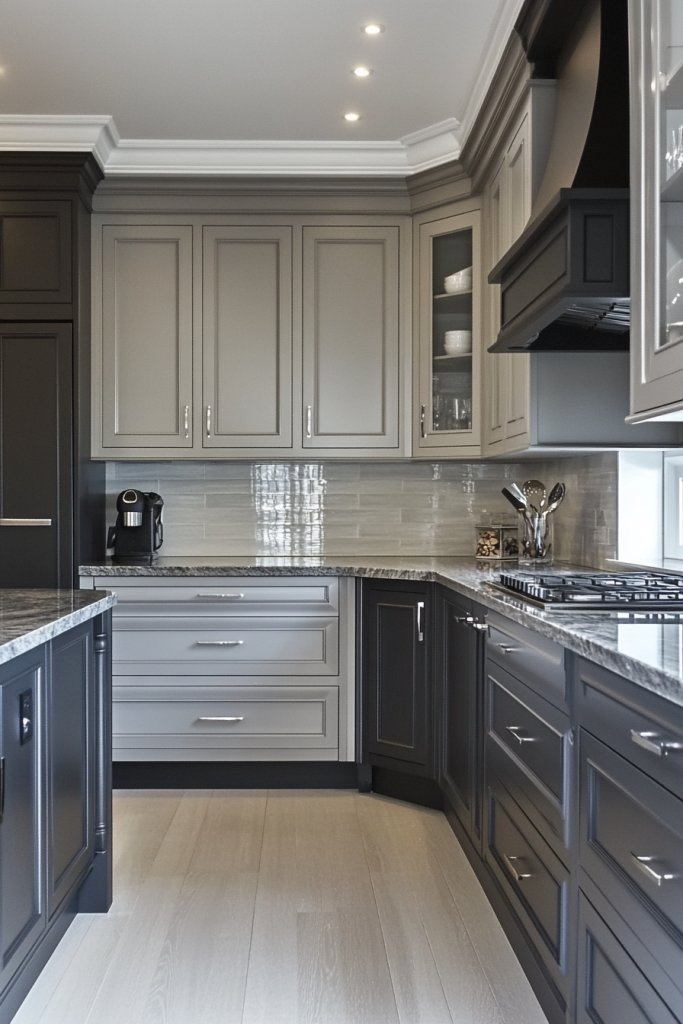
A monochrome two-tone kitchen uses one base color in two different textures or finishes across upper and lower cabinets to create depth without introducing a second hue. Pairing a matte lower cabinet with a slightly sheen upper in the same color produces a sophisticated, tonal interior that rewards close attention.
Choose a mid-tone color like warm taupe, dusty navy, or olive so the textural difference between the two surfaces reads clearly in natural and artificial light. Keep walls and countertops in neutral tones so the textural contrast between the cabinet surfaces remains the clear focal point of the room.
11. Two-Tone Cabinets, Mixed Metal Hardware
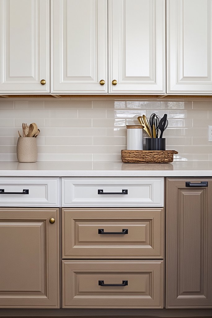
Using contrasting hardware across a two-tone cabinet scheme reinforces the color split and adds another layer of deliberate detail to the kitchen’s overall design. Matte black handles on dark lower cabinets paired with brushed brass or nickel hardware on lighter uppers creates a curated, editorial quality across the room.
Choose hardware with a consistent shape or silhouette across both cabinet zones so the only variable remains the metal finish rather than the form. Install a small sample of each hardware option against painted cabinet doors before committing to ensure the finishes complement rather than compete with each other.
12. Open Shelving, Closed Cabinet Mix
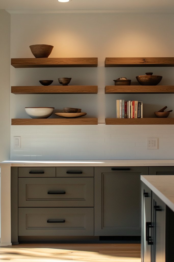
Combining open shelves in one color with closed lower cabinets in a contrasting tone creates a two-tone kitchen that mixes display space with practical hidden storage. The open upper zone feels lighter and more casual while the solid lower cabinets provide a structured, grounded base for the whole room.
Style open shelves with a consistent collection of items in a limited color palette so the display area feels intentional and decorative rather than cluttered. Paint the wall behind open shelves in the same tone as the lower closed cabinets to visually connect both zones and unify the overall two-tone scheme.
13. Matte Upper, Gloss Lower Cabinets
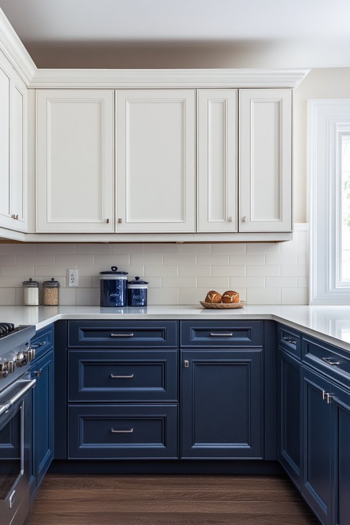
Pairing a matte finish on upper cabinets with a high-gloss surface on lower cabinets creates a two-tone effect that relies on light and texture rather than color contrast alone. The gloss lower cabinets reflect light upward while the matte uppers absorb it, producing a dynamic visual rhythm across the full height of the kitchen.
Choose a single neutral color like white, cream, or pale grey and apply it in both finishes so the material contrast stays the clear focus of the design. Clean gloss cabinet surfaces regularly with a soft microfibre cloth to maintain the reflective quality and prevent smudge buildup from daily kitchen use.
14. Scandinavian Neutral Two-Tone Cabinets
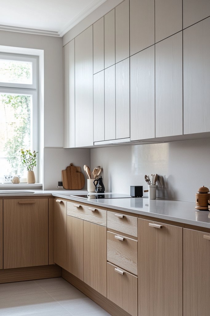
Scandinavian two-tone kitchens rely on a restrained palette of white, soft grey, warm beige, and natural wood tones to create a calm, functional interior with a clean visual rhythm. The color pairing stays understated and deliberate, allowing the quality of materials and the simplicity of the cabinet forms to carry the design forward.
Pair white upper cabinets with pale grey or greige lower units and add natural wood details on shelves or a kitchen island to introduce warmth. Keep countertops in light stone or pale laminate and walls in white or soft off-white to honor the minimal, light-filled spirit of Scandinavian interior design.
15. Painted Cabinet Insets, Decorative Borders
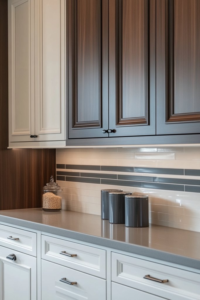
Painting only the recessed inset panel of a shaker cabinet door in a contrasting color while leaving the surrounding frame in the base color creates a graphic, bordered effect that adds visual interest without a full color change. This technique works beautifully across all cabinet units or as a selective detail on a feature wall of cabinetry.
Choose a bold or saturated tone for the inset panel against a white or neutral frame to maximize the graphic impact of the bordered detail. Use a small foam roller and painter’s tape inside the recessed panel area to achieve clean, sharp edges and a professional finish on every cabinet door.
16. Two-Tone Cabinets, Mixed Door Styles
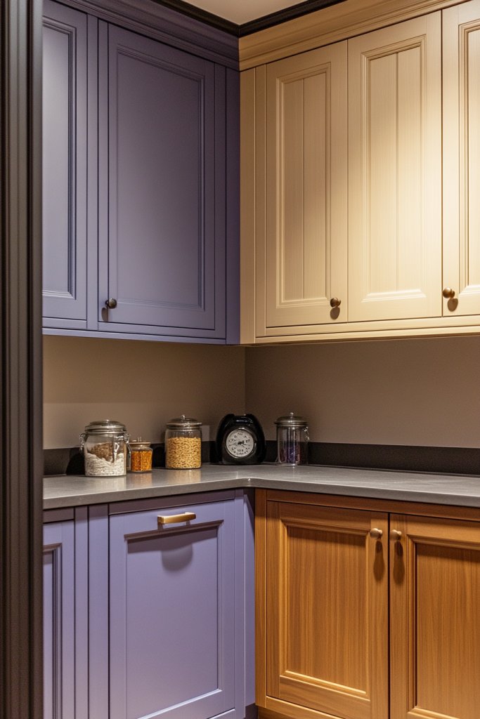
Combining two different cabinet door profiles across a two-tone kitchen, such as flat-front uppers paired with shaker lower cabinets, creates a layered interior that feels deliberately designed rather than uniform. The mix of door styles amplifies the visual difference between the upper and lower zones and gives the kitchen a custom, furniture-like quality.
Keep the two door styles clearly separated between upper and lower zones rather than mixing them randomly across the same wall to maintain a sense of visual order. Coordinate the simpler door profile with the lighter color and the more detailed profile with the deeper tone for the most balanced result.
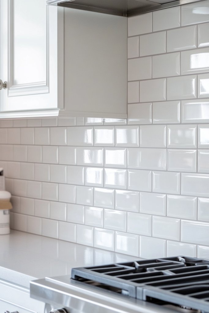
17. Two-Tone Cabinets, Contrasting Backsplash
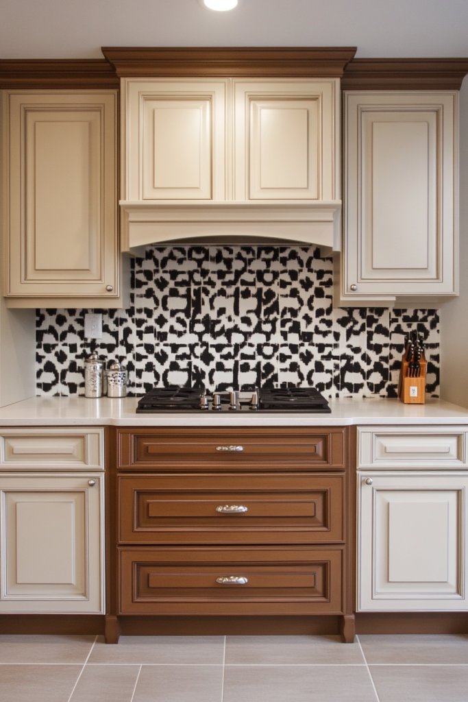
A well-chosen backsplash works as a third design layer in a two-tone kitchen, bridging the upper and lower cabinet colors and tying the whole room together. Using a tile that pulls one or both cabinet tones into its pattern or glaze creates a cohesive, intentional interior where every surface speaks to the others.
Choose a backsplash tile in a neutral grout color that sits between the two cabinet tones so it connects rather than competes with both surfaces. Extend the backsplash all the way to the underside of the upper cabinets to maximize its visual impact and reinforce the layered, designed quality of the kitchen.
18. Two-Tone Integrated Storage Solutions
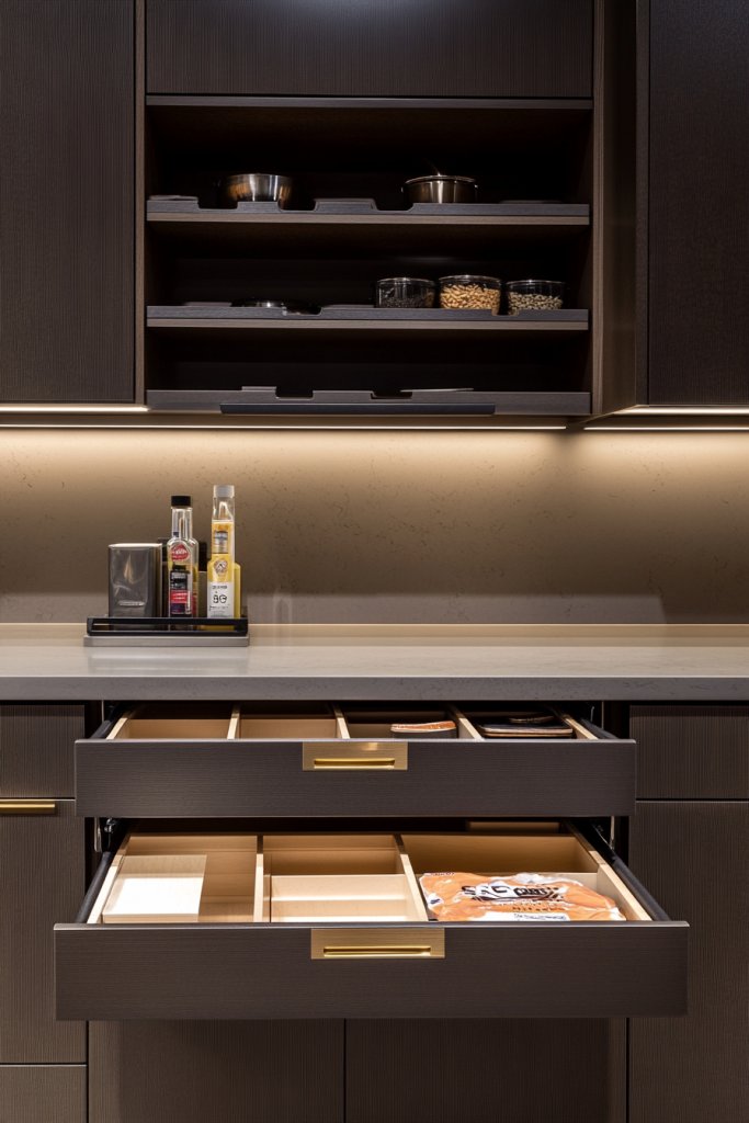
Building integrated storage features like pull-out pantry units, drawer inserts, or tall larder cabinets in a contrasting color to the main cabinetry turns functional storage into a deliberate design statement. Painting these dedicated storage zones in a deeper or bolder tone than the surrounding cabinets draws the eye and gives each storage area its own clear visual identity.
Use a consistent color for all integrated storage units throughout the kitchen so the contrast reads as a planned design choice rather than an afterthought. Fit interior drawer and shelf surfaces in the same contrasting tone to carry the two-tone story all the way inside the cabinet and create a satisfying, finished result.
19. Color Blocking, Geometric Cabinet Patterns
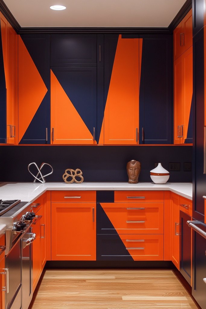
Color blocking across kitchen cabinetry uses bold, clearly defined zones of contrasting color to create a graphic, geometric interior that feels modern and visually energetic. Applying one color to a full column of floor-to-ceiling cabinets and a second color to the adjacent run produces a strong architectural effect across the whole kitchen wall.
Plan the color block layout on paper before painting to ensure the geometric divisions align with cabinet edges, countertop breaks, and architectural features in the room. Choose two colors with strong contrast and similar saturation levels so the geometric pattern reads with equal visual weight across both cabinet zones.
Start with one of these two-tone ideas that fits your existing kitchen style and build your color scheme from there. Small changes like new paint and updated hardware can completely reshape how your kitchen looks and feels.

I’m Sumayya and I love turning ordinary spaces into ones you’ll never want to leave. Whether it’s cozy cottagecore corners, bold maximalist magic, or sleek modern minimalism, I’m here to help you discover your style and bring it to life without spending a fortune. Ready to refresh your space? Let’s make it happen!